Spook Mania is an exciting Halloween-themed attraction designed to thrill families and enthusiasts alike. Offering a variety of immersive experiences, from haunted houses to interactive games, Spook Mania aims to create unforgettable memories each Halloween season. With a focus on fun and a sprinkle of spookiness, the attraction caters to all ages, making it a go-to destination for holiday festivities.
Project Overview
- Title: Spook Mania
- Client: Spook Mania LLC
- Date: February 2024
- Medium: Brand Identity Design
- Objective: To develop a cohesive and engaging brand identity that captures the essence of Spook Mania, a seasonal Halloween attraction.
About Spook Mania
Brand Strategy


#CREATIVE-DEVELOPMENT
Finalization and Presentation
01. Visual Elements
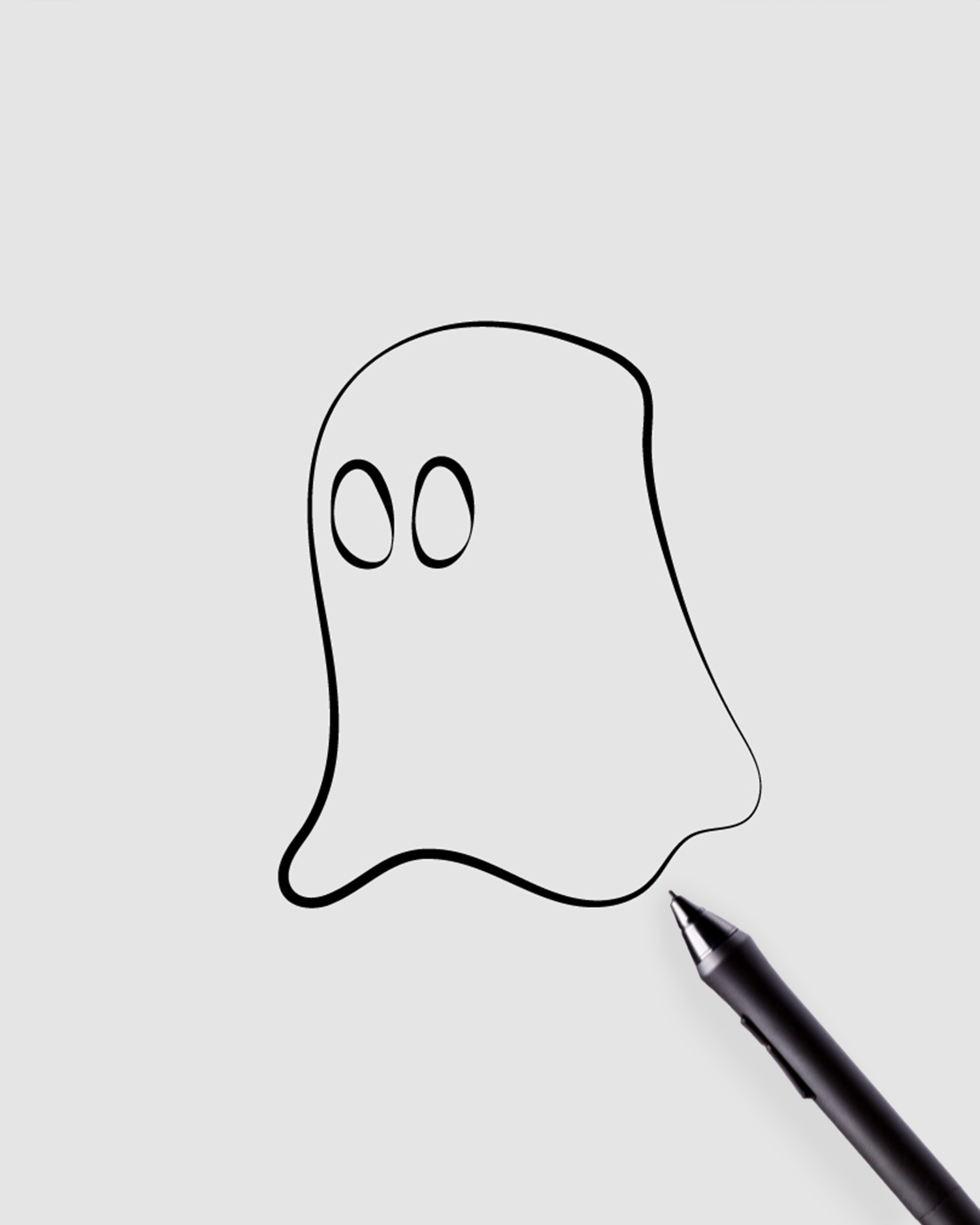
The brand identity extends beyond the logo to include playful illustrations of ghosts, bats, and pumpkins, which are used in various marketing materials. Additionally, spooky patterns were developed for backgrounds and merchandise, reinforcing the brand’s identity.
02. Marketing Materials
The brand identity was effectively applied across multiple platforms, including engaging social media graphics for posts and ads designed to attract visitors. Print collateral such as flyers, banners, and signage was also created to ensure visual consistency and appeal.
03. Client Collaboration and Final Adjustments
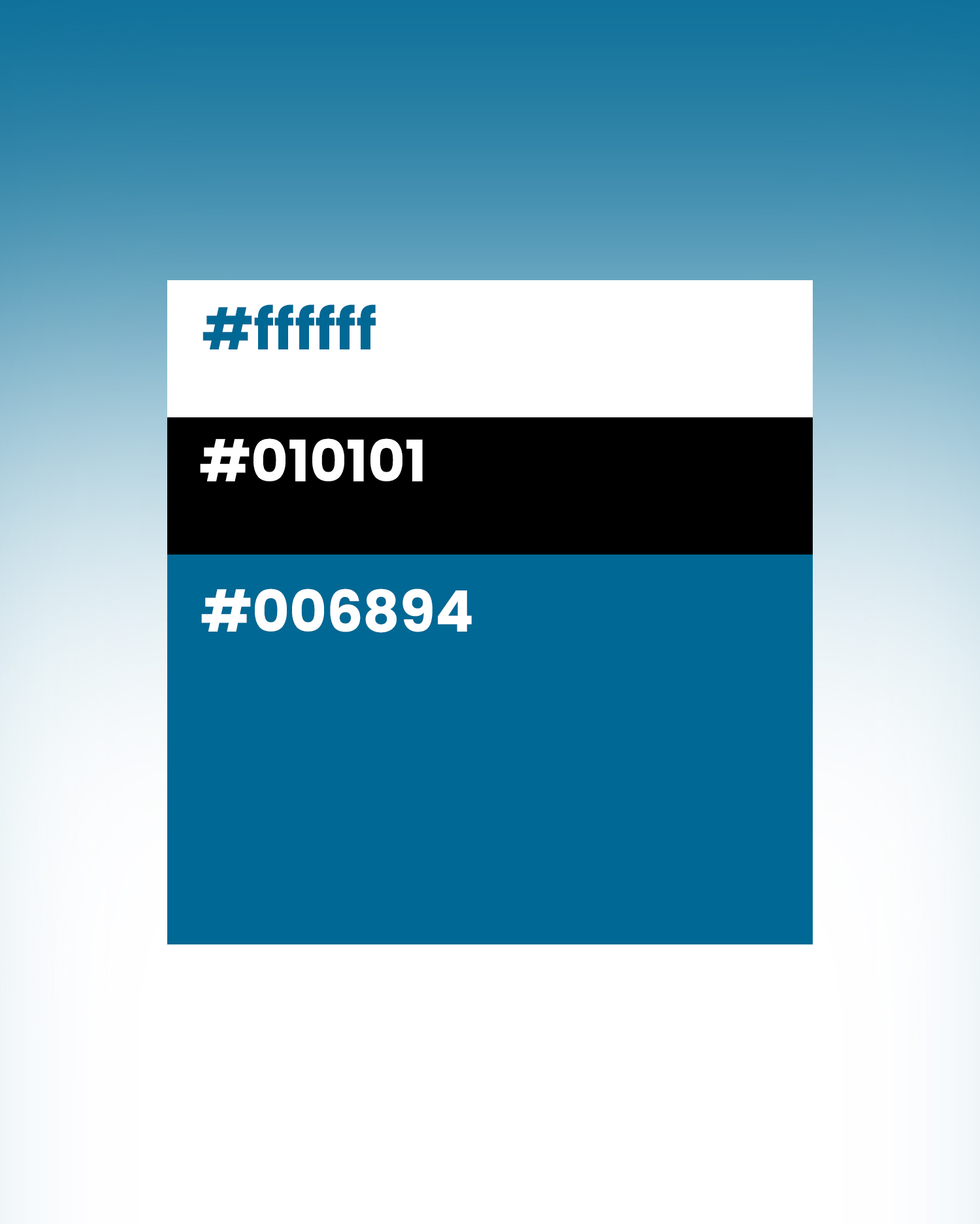
Regular meetings with Spook Mania LLC kept the design aligned with their vision. Client feedback was actively sought at every stage, leading to valuable insights. Based on this input, adjustments were made to color saturation and logo sizes to optimize the designs for various applications, ensuring versatility and coherence across all platforms.
Conclusion
The Spook Mania brand identity successfully captures the excitement and fun of the Halloween season. The combination of playful elements and cohesive design resonates with the target audience, enhancing brand recognition and appeal.


